Skip to content
Concept redesignGrowth packageWeb designCopywritingLocal SEO

Foothills Comfort Heating & Air

Home services · HVAC · Greenville, SC

A 30-year-old HVAC company with a great reputation and a website stuck in 2009. Rebuilt to turn late-night "my AC is broken" searches into booked repairs.

foothillscomfort.com
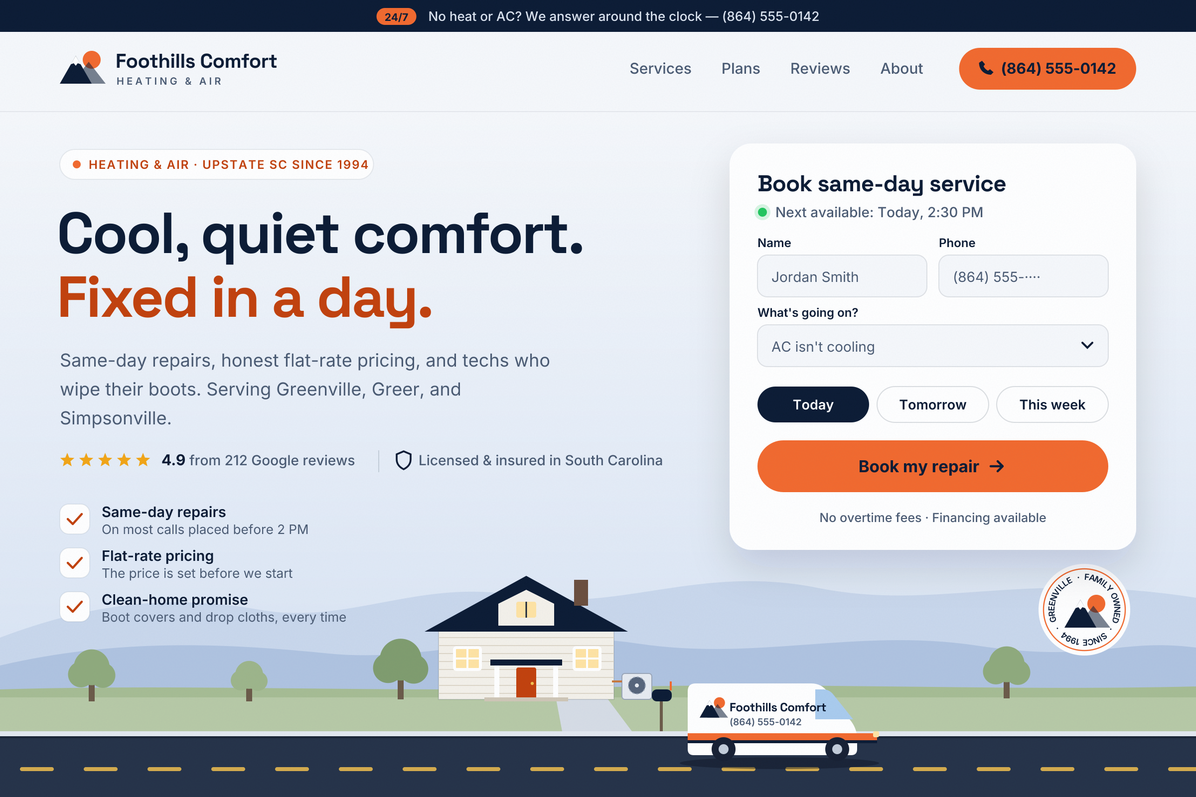
The redesigned Foothills Comfort homepage — a navy 24/7 bar, a mountain-and-sun logo, a one-tap orange phone button, the headline "Cool, quiet comfort. Fixed in a day.", review stars and a licensed-and-insured note, three plain promises, a Book same-day service form showing the next available time, and an illustrated street with the Blue Ridge behind a craftsman house, its outdoor AC unit, and the branded van parked out front, plus a "Family owned since 1994" stamp.
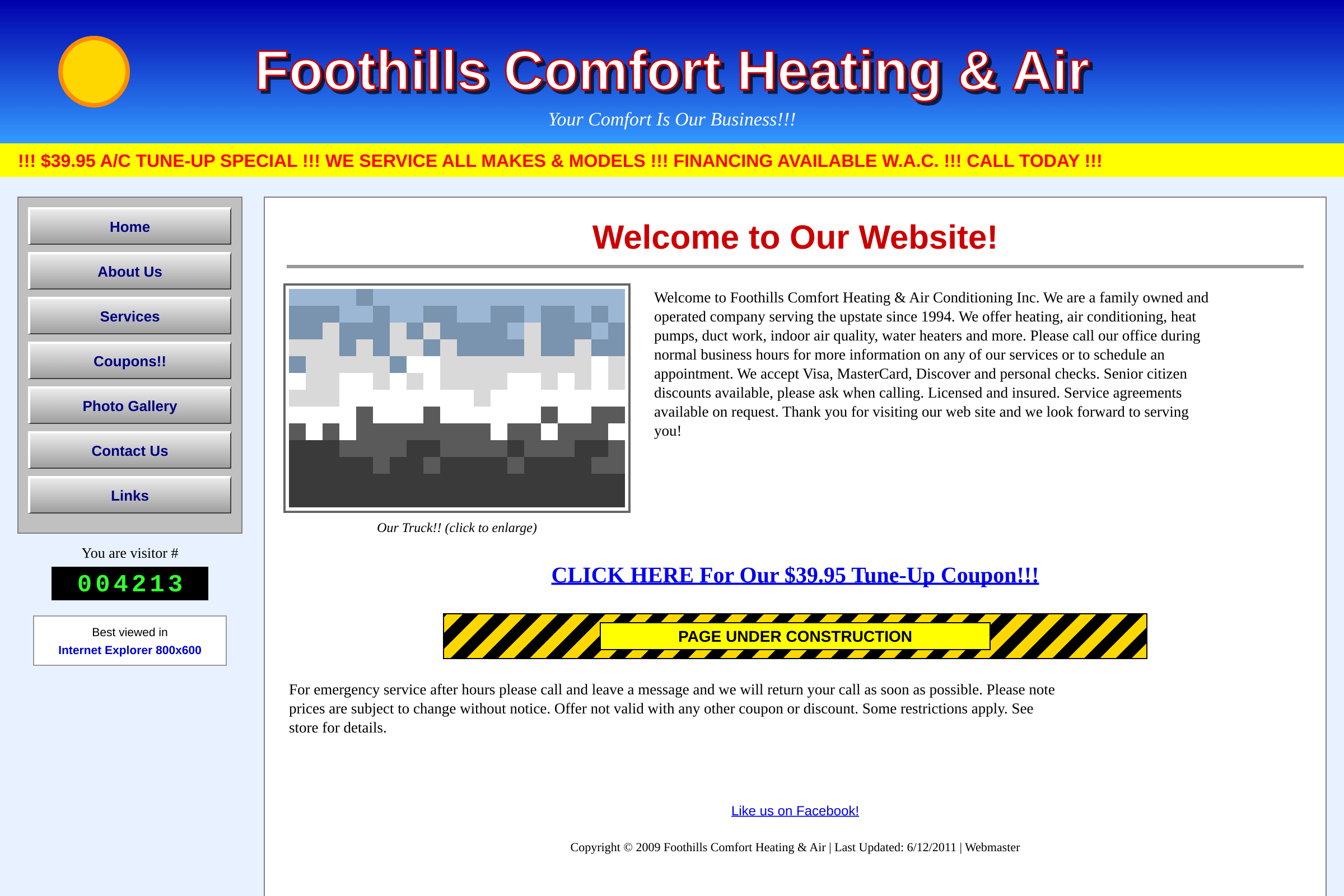
The old Foothills Comfort homepage — a bright blue banner, a scrolling red coupon ticker, gray beveled buttons, a visitor counter, and a wall of small text.
BeforeAfter

Drag the handle, or focus it and use your arrow keys.

The problem

A great business, hiding behind its website.

  1. 01

    The phone number was buried in a paragraph. On a phone, you had to pinch and zoom to find it.

  2. 02

    The homepage talked about the company ("family owned since 1994") before it talked about the customer's broken AC.

  3. 03

    A "$39.95 coupon" ticker and "Under construction" banner made the business look closed or careless.

  4. 04

    No mention of service areas, so Google had no idea they served Greer or Simpsonville.

What changed

New design. New words. Same great business.

Old headline

Welcome to Our Website!

New headline

Cool, quiet comfort. Fixed in a day.

Design

  • Phone number and "Book a repair" button pinned to the top of every page, one tap on mobile.
  • Calm navy and a single warm accent color — confident without shouting.
  • Real review stars up top, where nervous homeowners look first.
  • Service cards for AC, heating, and maintenance plans so people self-sort in seconds.
  • An illustrated Upstate street — a house, its AC unit, and the van parked out front — in place of generic stock photos.

Copy

  • Headline rewritten around what the customer wants (a cool house, today), not the company's history.
  • Flat-rate pricing and "techs who wipe their boots" moved front and center — the things customers actually praise in reviews.
  • A dedicated page for each town they serve, written for real people first and Google second.

Built to deliver

What this redesign is built to do.

to call from any page on a phone
1 tapto call from any page on a phone
to understand what they do and where
3 secto understand what they do and where
with their own local service page
6 townswith their own local service page

Concept redesign: a fictional business used to demonstrate my process. These are design outcomes, not measured client results.

The situation

Foothills Comfort has done honest work in the Upstate for three decades. Their customers love them. Their reviews say so. But their website looked like it hadn’t been touched since the first iPhone came out — and in a business where people search at 11 p.m. with a hot house and a cranky family, the website is the first impression.

The approach

Most HVAC customers visit a website for one reason: to figure out whether this company can fix their problem soon, for a fair price. Everything on the new homepage answers those questions in order — Can you fix it? How fast? Can I trust you? How do I book?

I kept the family story. It moved to the About page, where people who care about it will find it.

What it’s built to do

This is a concept redesign, so I’m not going to invent numbers. It’s built to make calling and booking effortless on a phone, to show up for “AC repair near me” searches in every town they serve, and to let 30 years of good reviews do the selling.

Your business could be next.

Tell me a little about your business. In a few days, you'll get a free mockup of your new homepage — words included. No cost, no pressure.

Get a free mockup